

billoboy2020
-
Posts
20 -
Joined
-
Last visited
Content Type
Profiles
Forums
Gallery
Store
Posts posted by billoboy2020
-
-
Hey guys!
How good/bad are these? I thought i got the basics figured out but i cant seem to get over the kinda straight letter pieces, to a point where i sometimes get frustrated and think i just lack creativity.
Thanks for any responses, have a good day.


-
 1
1
-
-
thanks man. i get what you mean by wet noodle looking, this isnt the first time you said it to me also lol. Im struggling to change my bars without them looking like a noodle tho.
-
1
-
-
 how do you feel about this?
-
1
-
-
ah, i uploaded the wrong file. this is the right picture. dont know how to edit my post.

-
1
-
-
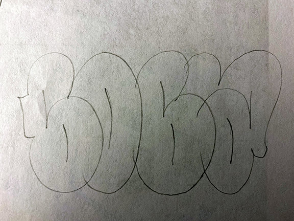
hey guys, how do u like these 2? strugglin alot with T


-
i have another question. what are some usefull threads on here that are good for toys to binge? there are so many im kinda overwhelmed lol
-
8 hours ago, Joker said:
@billoboy2020- I think you’ll benefit more from not hiding the right bar of your R.
Looking at your piece you’ve got somewhat of a perspective thing going on. Both ends are curved inward, and the piece overall gets bigger toward the ends. When working on a piece like this first draw yourself some guides (like I’ve done in green), this will set you up for a perfect execution when drawing out your letters. Your overall structure will be consistent from left to right. Currently, your piece dips on the right which makes your letters get smaller as the piece reads left to right.
Something else to note, when doing a perspective style pieces it’s nice to do perspective style 3D, too. Set yourself a vanishing point (that little red dot I’ve drawn at the bottom) and line out your 3D to the point. I’ve explained this in a previous post so I won’t dive deep, but hopefully you understand.
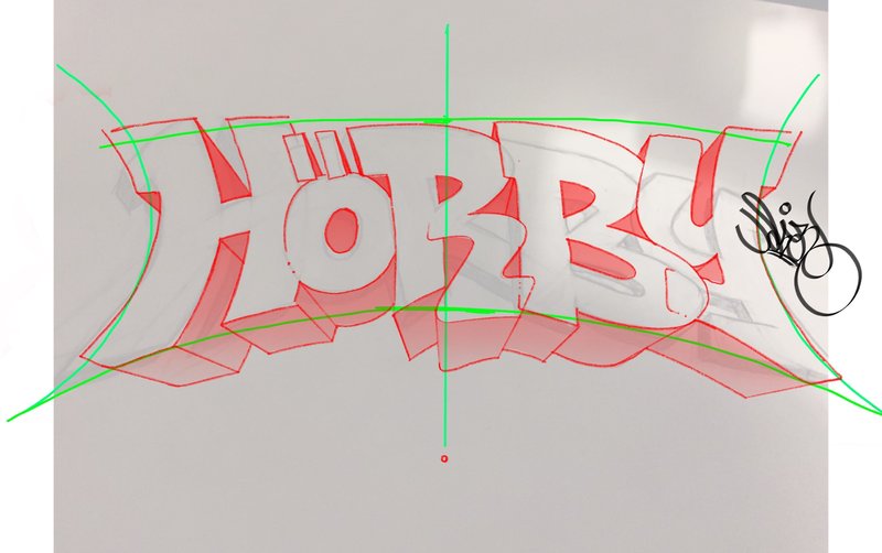
yea i realized the same thing after a while. i changed it and also i did the Ö bigger because i feel its kinda messing up the flow (i guess).and i took ur 3d bcz it fits so good.

-
1
-
-
3 hours ago, Joker said:
Re: Layering
In Graffiti there are definitely some hard rules, no doubt, but when it comes to style and lettering - what you do to set yourself from others is free range. When it comes to layering letters... do what works.
Look at this CanTwo piece, specifically the NTW connections. The letters layer over one another perfectly, revealing the important sections of each letter to show the viewer the bits that matter. Little notches where the letters overlap show you, in an almost transparent way, how those letters are layered upon one another.
Use layering how it best works for your letter connections, and if needed add some lines to reveal the letter underneath the other. No hard/fast rules here, just discovery.
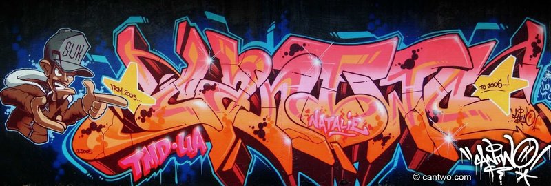
ok i see. ive changed my drawing a bit and tried to overlap some bars. idk if like it more or less, im not sure if i should hide the bar of my R.
-
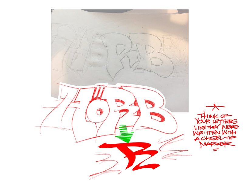
On 11/11/2019 at 9:14 PM, Joker said:
@billoboy2020- Yep! That is looking pretty good. The right bar of the H, at the top, is curving into the umlaut - that feels forced. I think keeping the flow of the top of the R going into the top of the H feels better, more natural. See sketch below.
The Y works, but it's not as dynamic as your other letters. The letter Y can be difficult, no doubt, but definitely keep playing around with how the shape of the letter fits into the B. Eventually you'll find the one that works really well and you can build off that one.
You can also look at what other writers with a Y in their name are doing. Just go to this page and scroll through the names looking for that letter Y.
.thumb.jpg.6fb1368d19a1178a4296546d05f54bcc.jpg)
Ok man, that looks really dope and i gotta agree the Y looks stupid. Since u already, imo, perfected the piece i drew another with a similar style but kinda different. Another question tho, i dont know any rules about layering. See i always thought u should layer from left to right, so that the H is infront of the ö wich is infront of the R. I saw on ur sketch that u put the Y infront and i think that would give me more possibilities obviously but i always thought that was a no go.

-
On 11/5/2019 at 6:46 AM, Joker said:
Because you singled this one out I’ll give some feedback...
I think I mentioned this to Ray, but some of your bars look like you took a ball of clay and tried to form them into parts of a letter... specifically the left bar of the R. Try to think of each bar of your letter being the same weight (except the middle bar of your R and B should be thinner). You can stretch sections out, like toward the end of the bar or maybe a rounded section, but try to keep bar weights similar. That B is pretty good but the R looks like it’s got some work to do.
I played around with it for a second just to give you an idea of what to consider...
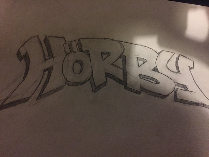
thanks for taking the time man, looks really fucking dope. okey so i used ur drawing as help and this is what i got. im really bad with extensions and i cant really make the piece dance, if u know what i mean. also i suck with negative space i think.

-
1
-
-
4 hours ago, Joker said:
These are definitely stand-outs for me. Each one you posted is different from the other which tells me the writer is learning, still. They haven't found the one style that feels comfortable from which they can grow, which is typical. I don't mean that as a bad thing, I mean... after 34 years of writing I keep changing my style up, though I do linger in one style for quite a while.
Anyway, your friend's work isn't bad.
ok thanks joker im gonna tell him that.
I drew a lil bit in the last days aswell, i tried to write Hörbi (ö is a german letter, idk how to explain how it sounds but its something like the ea of early i guess) so Hearby would probably be the closest.
Idk if these are any good, ive tried to make them pretty simple with nothing to fancy. im just trying to sketch alot over the winter. The last one isnt finished as u can see but i liked the R and the B so far and wanted to know what u think of it


-
-
What up 12oz
one of my friends can draw really really well but hes still new to grafitti. He always sends me pictures of his shit and to me it looks dope. sadly tho i cant help him that much since im a big toy but i thought maybe if i post his work here u guys could give him a couple of tips.
Thanks guys


-
1
-
-
11 minutes ago, Joker said:
Honestly, no. Throw-ups, like everything else in Graffiti, take A LOT of time to master. And just like simple-style pieces, it's best start off simple and not complicate the process too much. A throw-up is designed to be executed quickly. The less stop and go, the quicker the process.
Essentially what you've done is give yourself a lot to think about while putting this up quickly. When you're starting out you want to simplify things for several reasons. First, you want to be able to initial outline/fill-in/final outline while watching over your back. Your sketch has a lot of parts to it which would make watching over your back difficult. Second, you want to be able to do this quickly, even on paper. Throw-us are not something you draw or take your time with.
Keep it simple, think quick execution, and walk away.
Try something like this:
ok thanks man thats something i can work with. What do u think of the looks of the throw in general? if time didnt matter i mean. gonna draw something easier now tho and upload it
-
2 minutes ago, LUGR said:
No
darm brother why not. can u give me some tips. i really like it tbh
-
is this throw any good?

-
yea it does. thanks joker. have a great day
-
1
-
-
15 minutes ago, Joker said:
For starters, I agree that getting the letter B perfect can be a tough one (at least for me) but there are plenty of solid Graffiti writers out there to disprove that thought - the first two that come to mind are Bates and Mr. Baker, I would take some time to study what those two and other writers whose name start with the letter B are doing and see how they're setting the letter up, and how they structure the B into the next letter is also important. You can go through the B section on ArtCrimes as well for a thorough look into writers who use B in their name. There's bound to be inspiration there.
I think if you're struggling with the letters, and you're admitting you're still toy, then that struggle is right where you need to be. There's no easy "in" with Graffiti. You quite literally have to put in the work to get something out of it. We can help you break through the struggle should you honestly want the help and are willing to take constructive feedback and apply it to your work. It shouldn't be that hard if you have folks like myself and a few others on here nudging you in the right direction. So... try not to think of it as a struggle but more as a learning process. Easy for me to say, I know, but trust that I've also been in the same position hundreds of times over my 35+ years as a writer. The letter J absolutely sucks... I still hate it to this day, and often throw in the towel on pieces just so I can be done with it and move on. It's all a part of the process. Most of the time you're not going to like a letter in your piece, but when you nail every letter... it's truly satisfying.
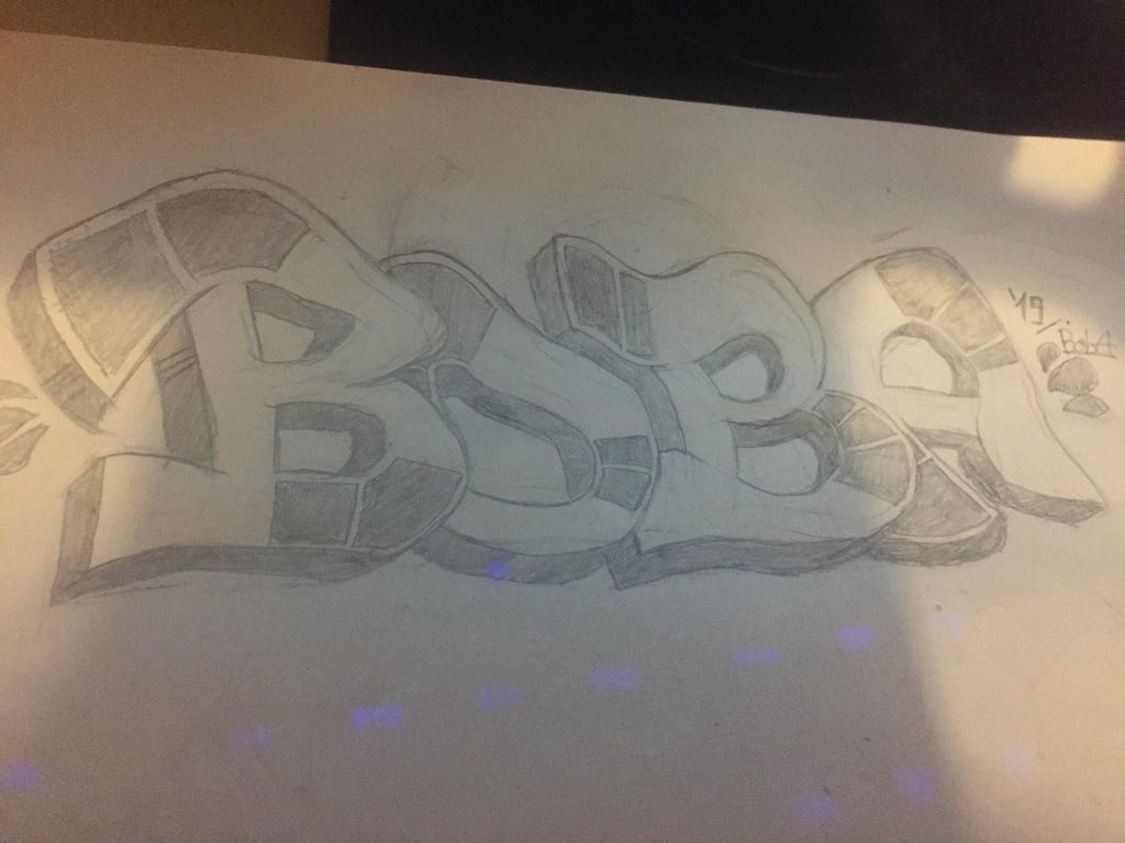
I say no to the name "Herby". Maybe "Herb" could work but then you're setting yourself up to be ridiculed by your peers. Stick with "Boba". As a guy who was 11 when Empire Strikes Back came out, and immediately a big Boba Fett fan, I say stick with Boba.
Ok man, tho i must say im not sure if you got my point. I dont have anything against the letter B in general, i know you can make it look dope and i still need to train alot to be able to but im more talking about Boba as a name. You know i can only play with 2 B's, O and A. Bates and Baker have more letters to play with. Same with your name. Writing 'Joja' would suck also.
Idk man, i like star wars also alot, but i would like an objective critic on the name itself. And maybe some general tips for name choosing.
Thanks for the reply tho man.
-
What up 12oz
Im a toy with a couple of question and in need for critcal advice. Ive been following this thread for 1 week now and id like to thank Joker (and the others) VERY MUCH for still sticking around and helping us toys with great advice even though this forum is not as active as it used to be (sadly)
I really like the advice u guys give and because im kinda struggling ive decided to make an account and ask a couple of questions.
Ive peen painting on paper for a bit and i think this pictures is the best ive drawn.
So i really love this name, but with the time i struggle to draw nice (more then basic) B's that look good because i feel like there is only so much u can do with a B. Ive seen many pics (mainly on nitro combis tumblr) and ive noticed that many writers dont have a B in their name and if they do it looks basic. This is not a problem per se bcz not every letter needs to look super special. But the thing is that my name consists of 2 Bs and one O so i feel like i cant do anything more than basic with this name and im kinda stuck.
Thats mainly why im here. Maybe u will just tell me i need to get better and tbh im kinda thinking the same. But at the same time im thinking, why make it harder than it already is. u feel me?
I thought about drawing Herby (is that a good name?) and if it sucks maybe you guys could give me some knowledge what makes a good name that flows well. Ive searched on reddit and other websites about the 101s of name choosing but i couldnt get a good guide.
Anyway, thanks again so much Joker and all the others for helping us out. We all really appreciate it.
Also, excuse any mistakes i made. Im not a native speaker but youll hopefully understand me.
-
1
-


.jpg.ce953c6acb9f7cb95051ef8abbb9a8b2.jpg)


Toys post here...
in Paper Chase
Posted
thanks for the fast feedback LUGR (and thanks for the others like joker or mr. yuck for taking this time and giving so constructive and high quality critique btw)
I think i know what you mean by blobbed-out letters. Probably the A,T,N on the blue/pink piece or the A and N on the piece below that. Ive tried to bring some variety into it by not always cutting the bar with a straight line but I can see how it looks kinda weird now so thanks for that.
I did a quick redo of my pen sketch, without the wonky legs. Ive tried to refine it as well and did a second sketch, tho i had trouble adding stuff/making new versions without changing up the original sketch too much.