

enteruncreativename
-
Posts
456 -
Joined
-
Last visited
-
Days Won
19
Content Type
Profiles
Forums
Gallery
Store
Posts posted by enteruncreativename
-
-
On 10/17/2019 at 7:40 PM, Limeliciouz said:
Actually those effects - *cough*characteristicsbutIdoubtuknowthediffyet*cough* - were necessary.
Thank you for the rest of the feedback tho.
Some feedback for you: try practicing some bars with constant width, all your letters are uneven. Your bubble letters seem good tho. Are those one liners?
What I meant was for you to focus on the letters themselves before you detail on the effects on top of them.
No problem and I think the inconsistent bars are just my style of expressing different parts of the word. But I tend to make them go taller so, yeah that is something I should pay more attention to. Thank you and yes they are one liners.
On 10/17/2019 at 7:02 PM, Joker said:Are you looking for feedback or just contributing?
I was contributing something to be commented about if someone wanted to. Your piece is 🎖️ though.
-
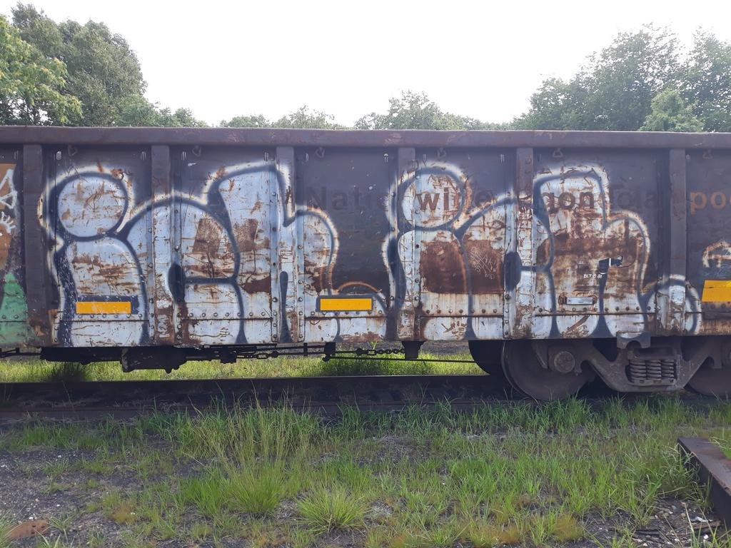
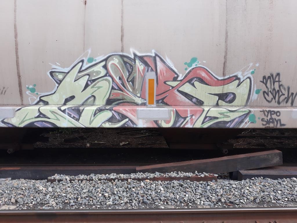
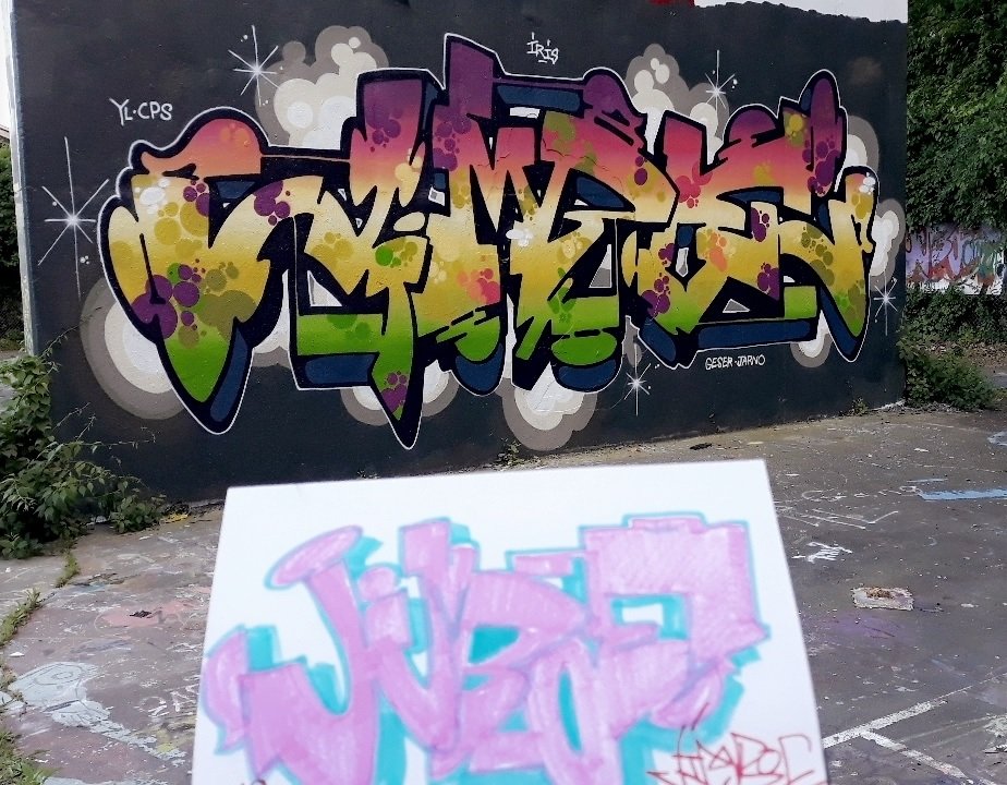
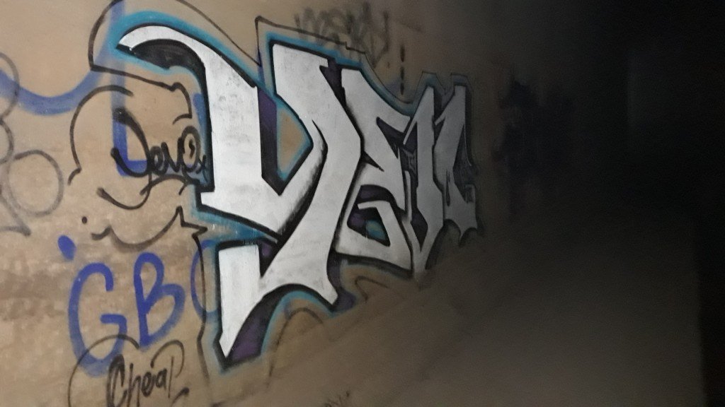
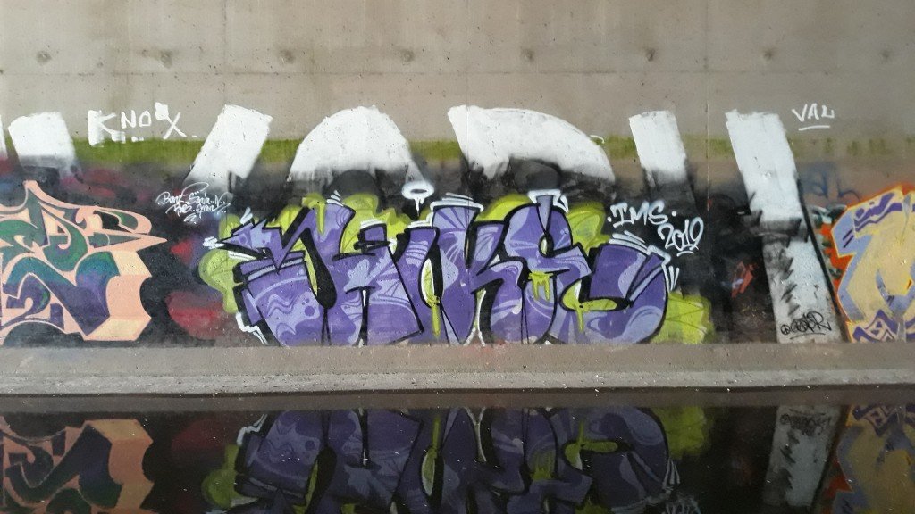
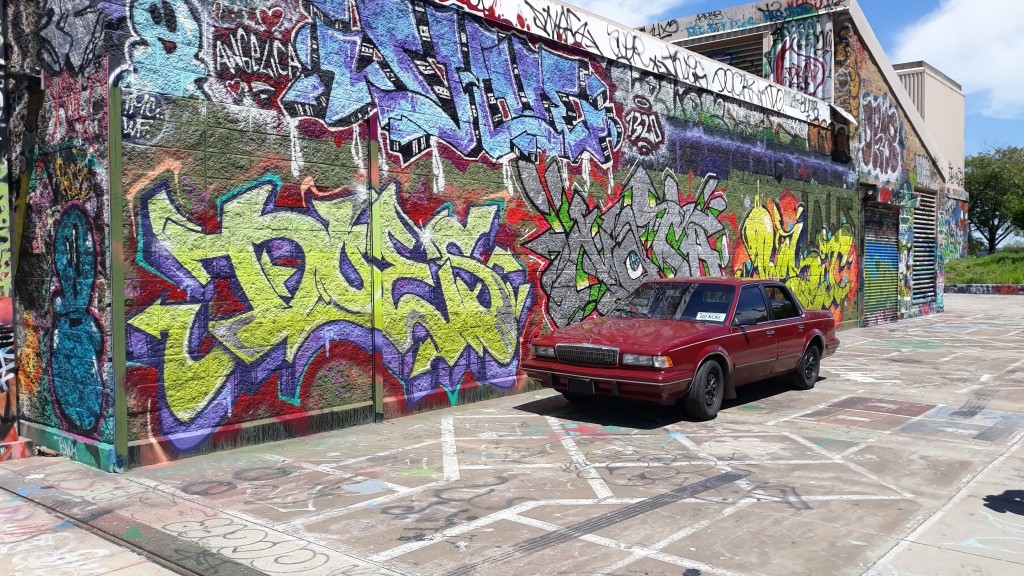
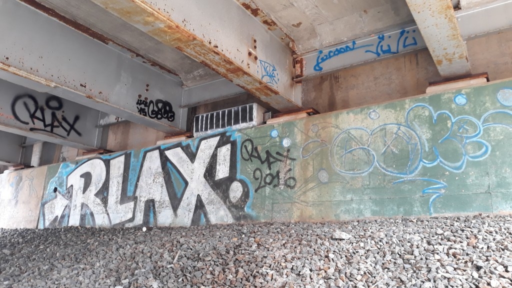
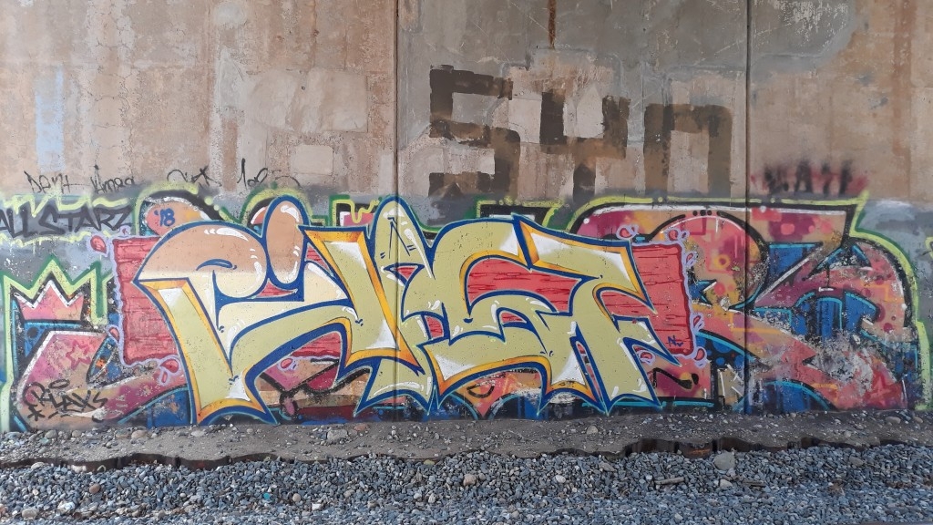
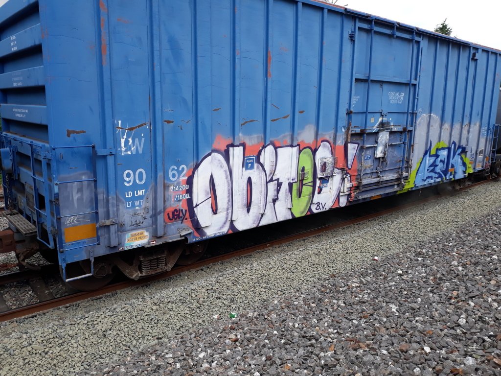
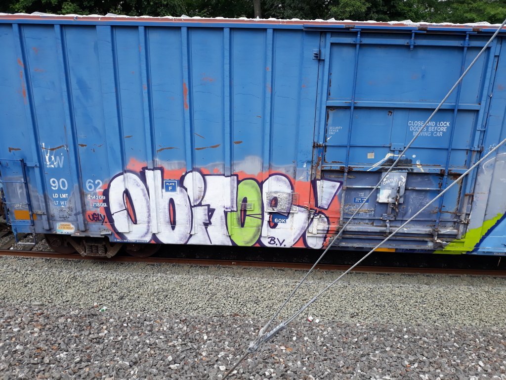
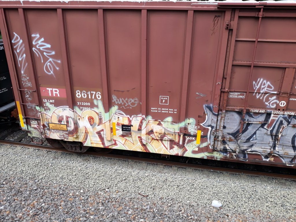
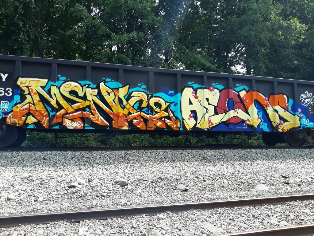
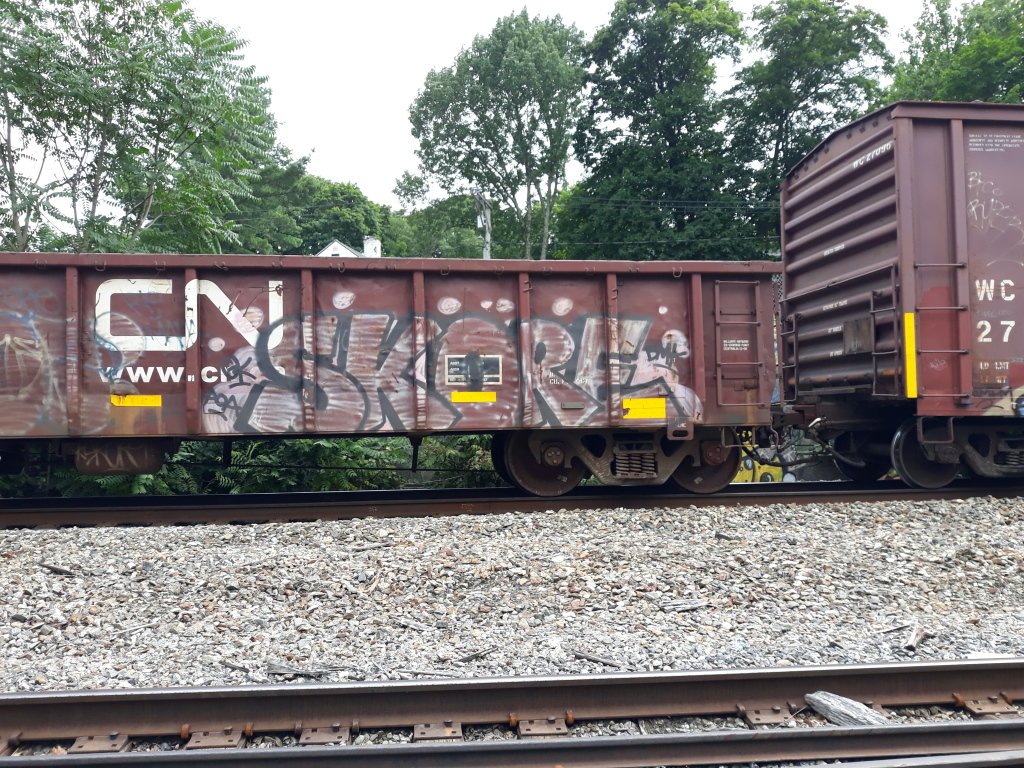
The top one is the best overall in my opinion. The flow of the letters starts off well with the base of the L and there are no extra add ons on the piece. The unnecessary effects on the second piece takes away from your letters which don't flow in that example. To be specific here - all of the letters get progressively smaller from the start. As far as the third goes, the LIM flow well but the E is too small in comparison to the L and the M. The I flows acceptably well because of it's width (I would personally make the top of it a bit higher though to stay in flow with the other letters).
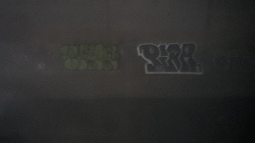
Here is my contribution to the thread:
-
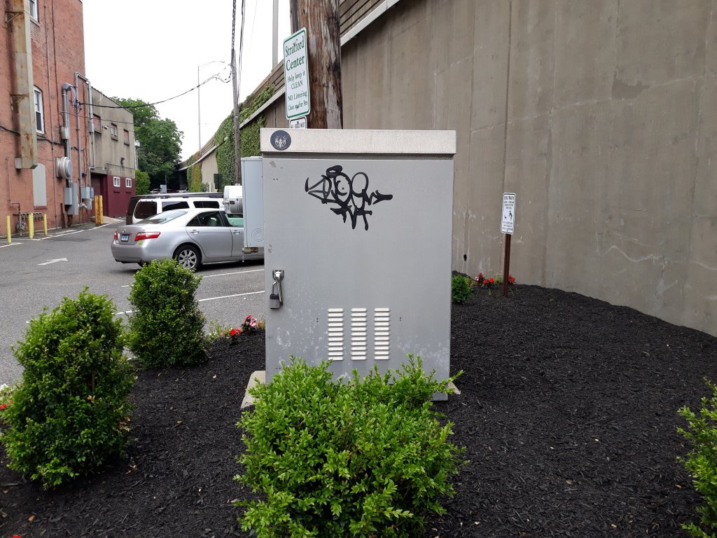
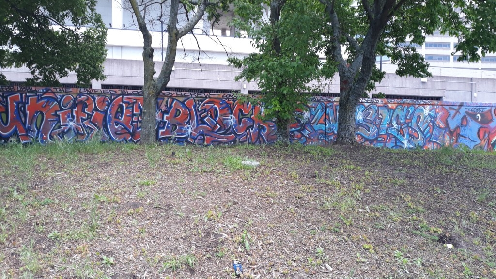
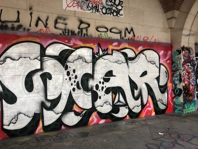
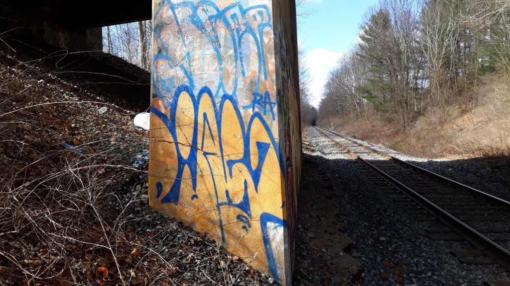
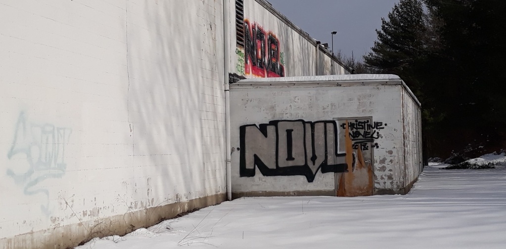
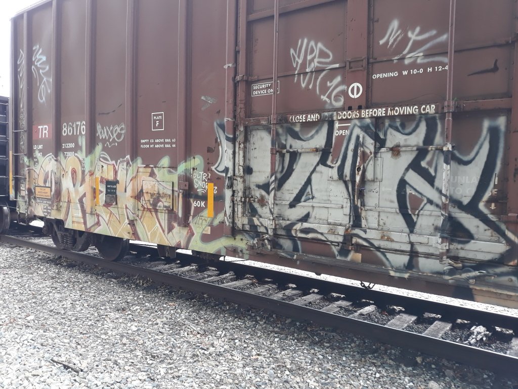
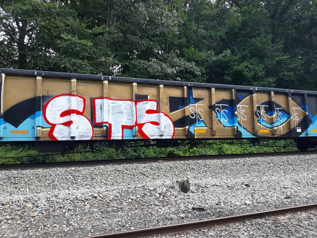
The tag on the door set in well...
-
 1
1
-
-
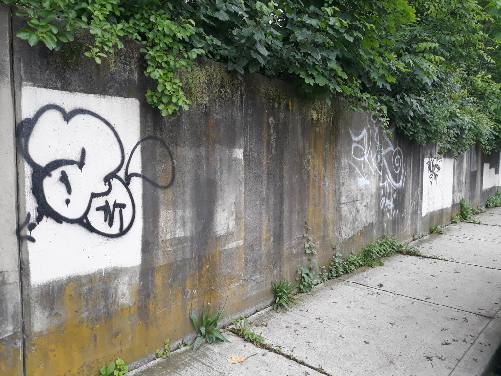
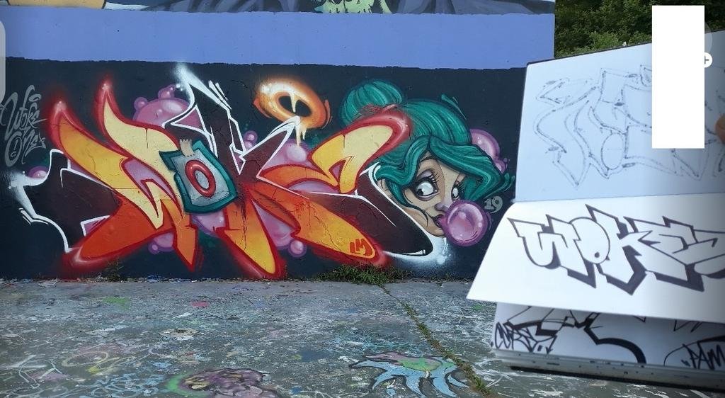
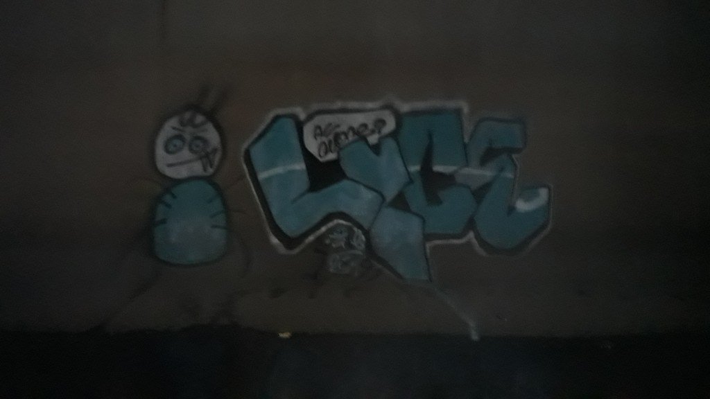
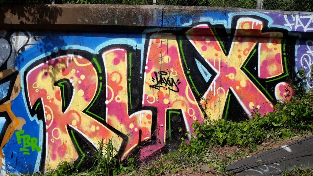
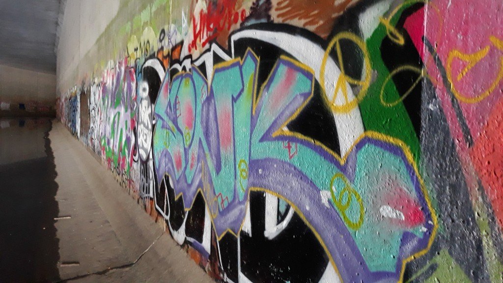
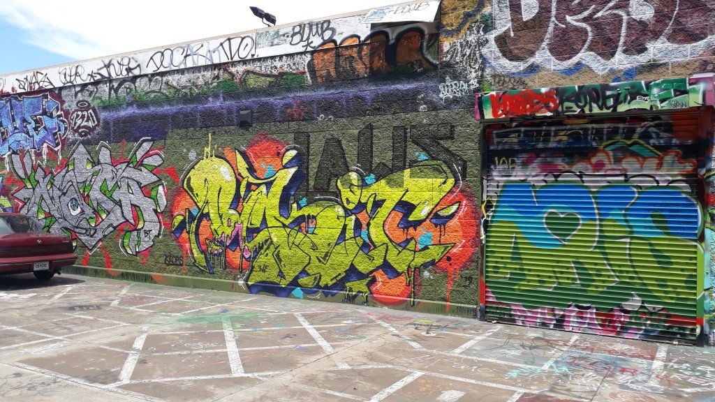
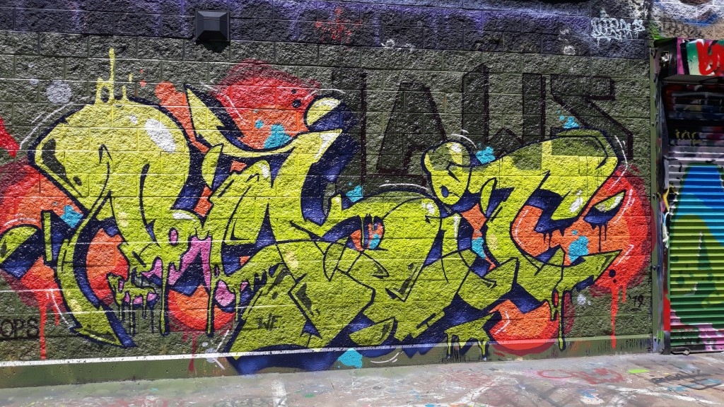
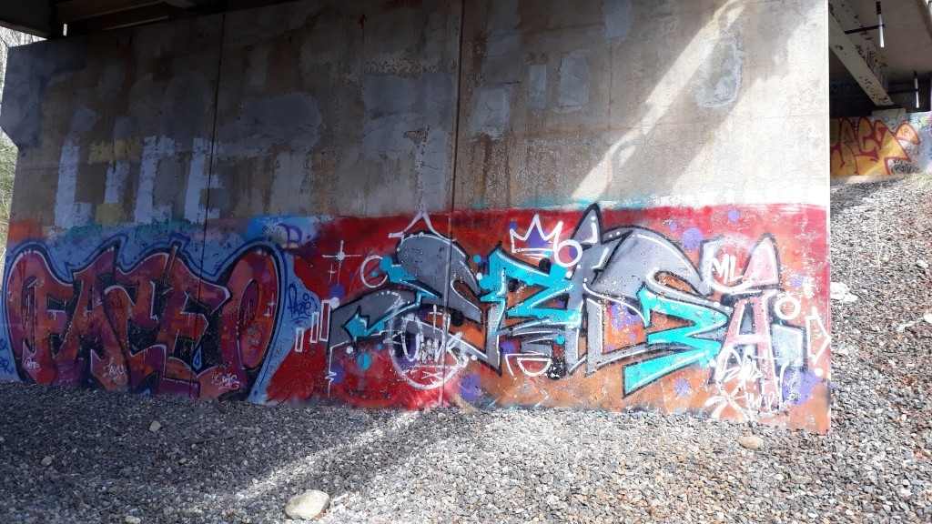
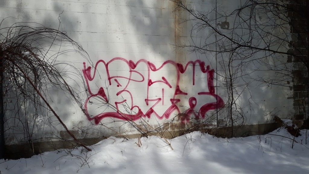
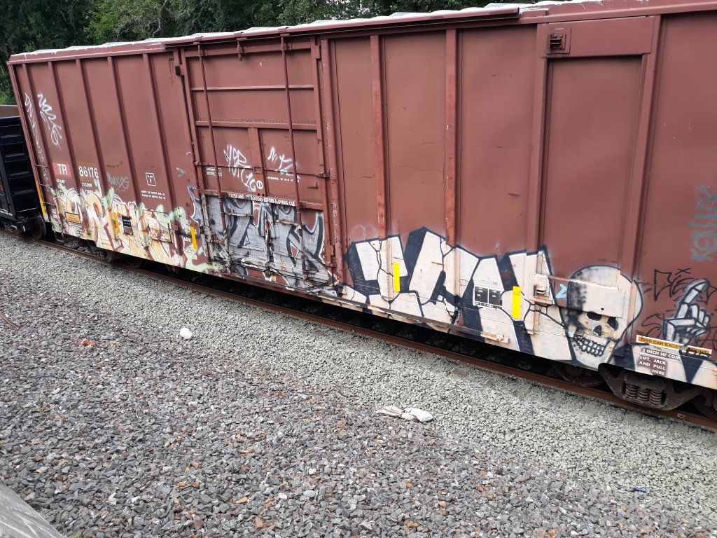
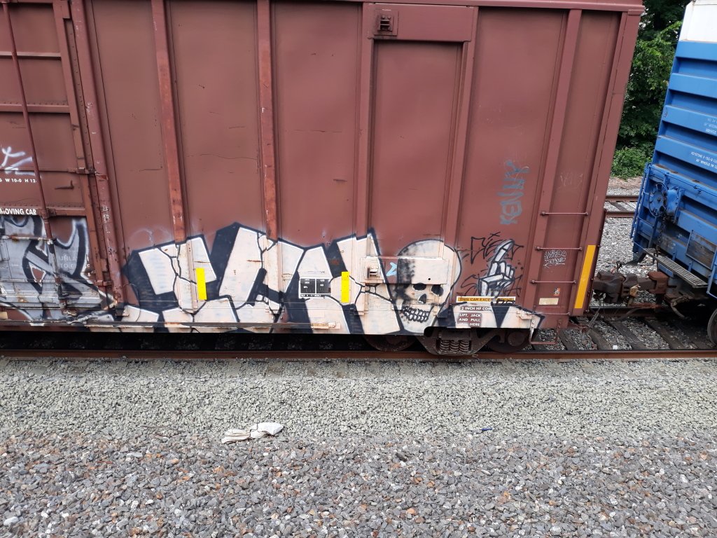
I feel like the Ri connection could be seen to be a u. The bottom of the E is dope with the way it kicks back.
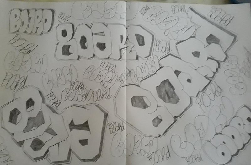
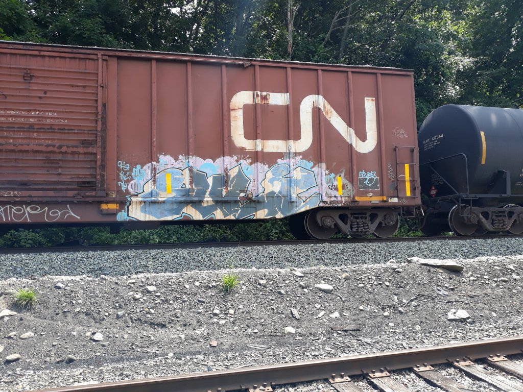
Just some bored drawings.
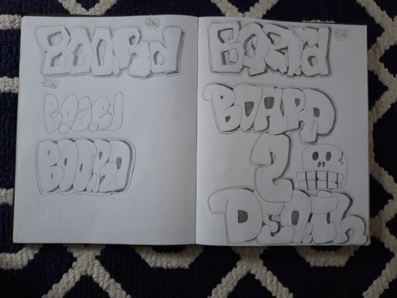
My skull looks terrible though.
-


Fun times.
-
55 minutes ago, misteraven said:
Also, should have said this in the initial announcement, but I will be stuffing a bunch of stickers into all orders. Will go extra heavy on the international guys that end up having to pay extra for shipping.
So yeah... FREE 12ozPROPHET STICKERS IN ALL ORDERS!
Haha, I bought the tshirt and a pack of stickers before I read this thread.
 I love stickers!
-
1
-
-
Connect-i-cut in 2010 summer I heard about this.
-
1
-
-
-
-
I'm from before 2015 and I think that makes me old enough for a discount code! I'm game to buy one with a code.

-
2
-
-
With a new week comes a new post!


Those are some hot spots... ?
-
Painting and book work!
I hope I get a passing grade with this paperwork.
-
1
-
-
Continued...


Goodbye you two canoe riders. ?
-
Today was a nice swim.


My apologies for the bad picture Gator.
-
In a port by a bridge while watering some berries.


?
-
1
-
-
Southern side.

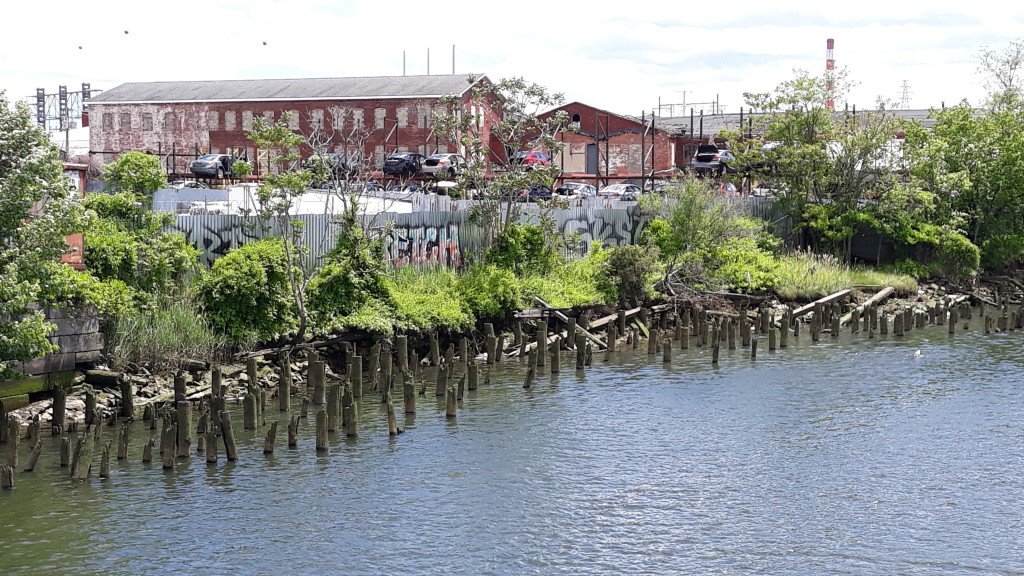


I'm feeling some moods now.
-
Cool story bro.


I'm going to stay woke now.
-
1
-
-
BUMP! Sorry if anyone gets bothered by the gravedigger of a post.
Not my pictures.
-
1
-
-
-


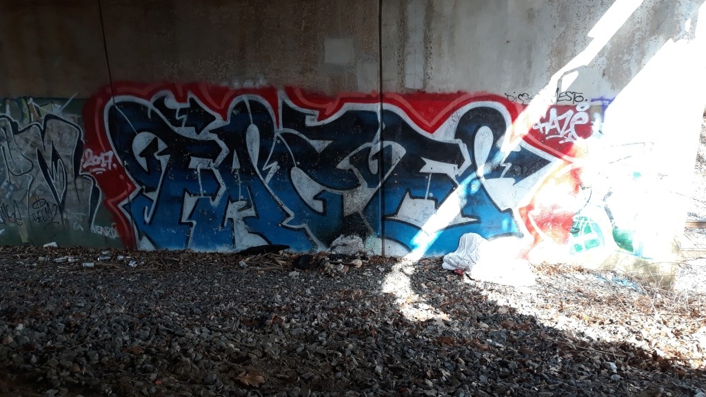

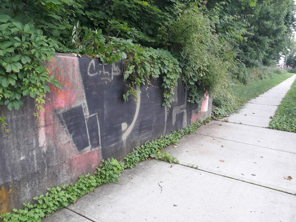
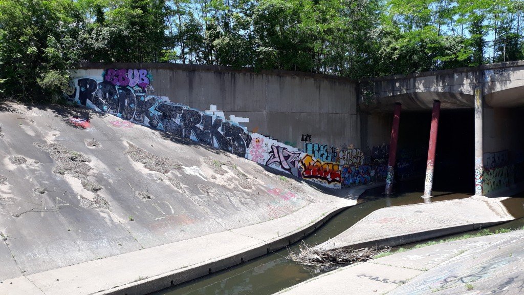
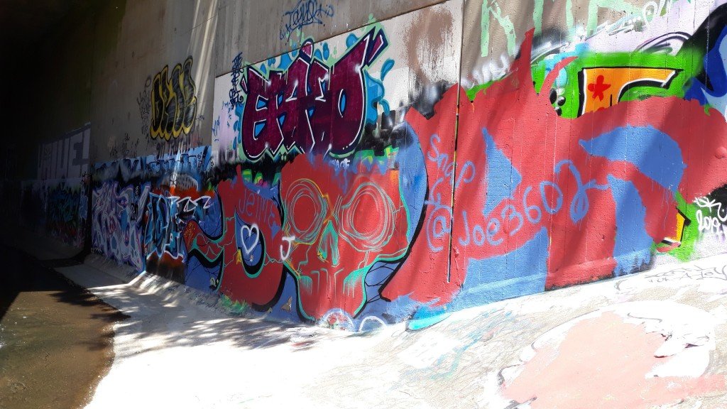
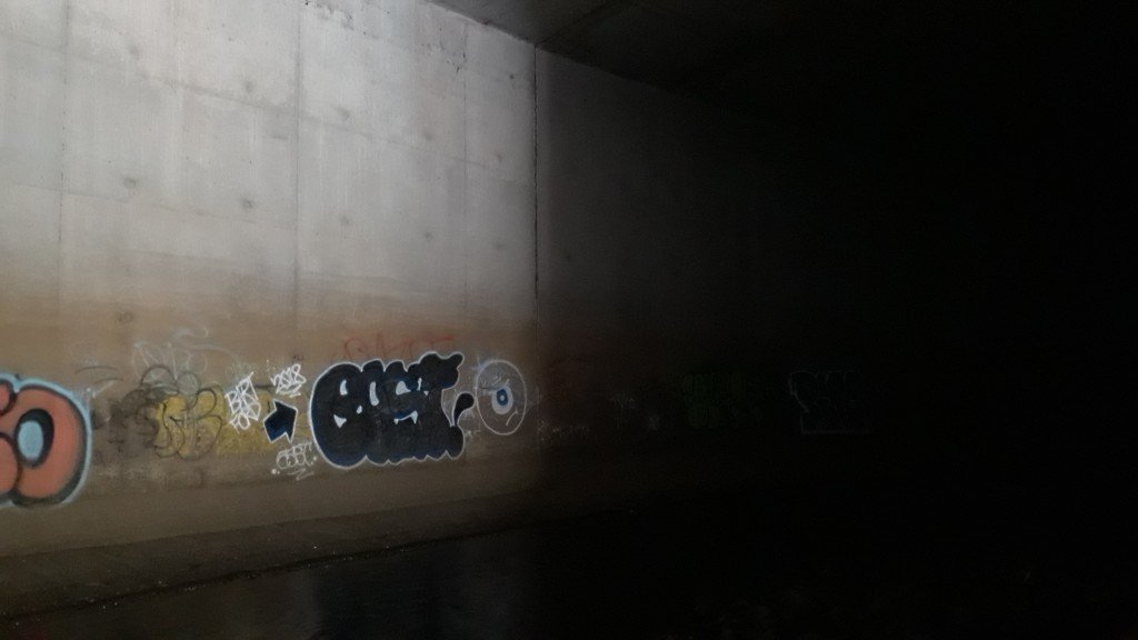
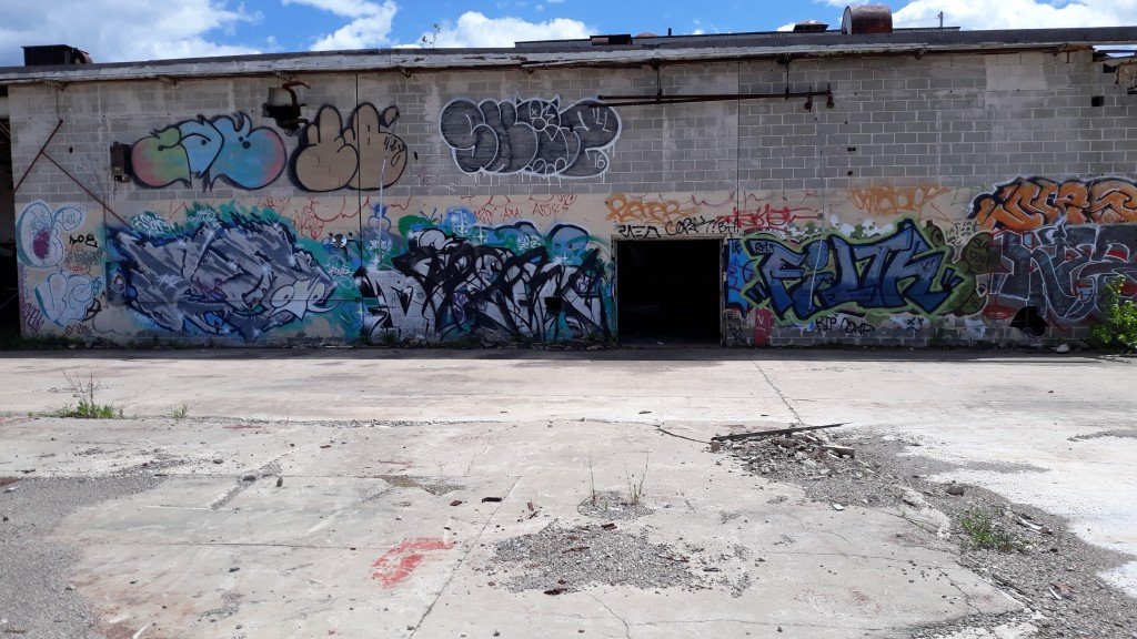
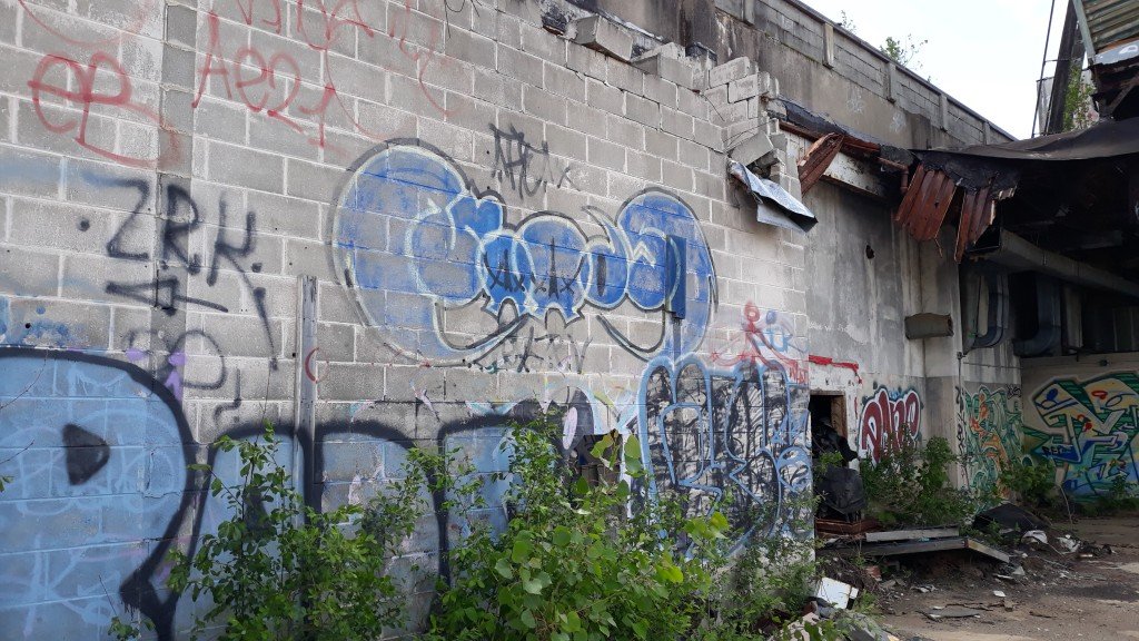
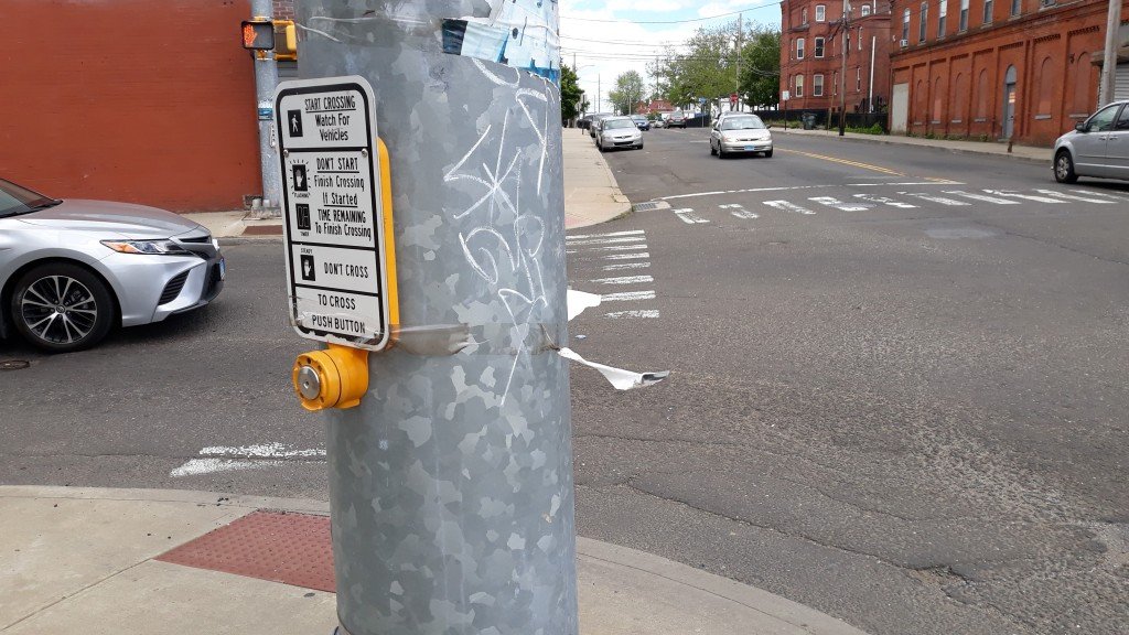
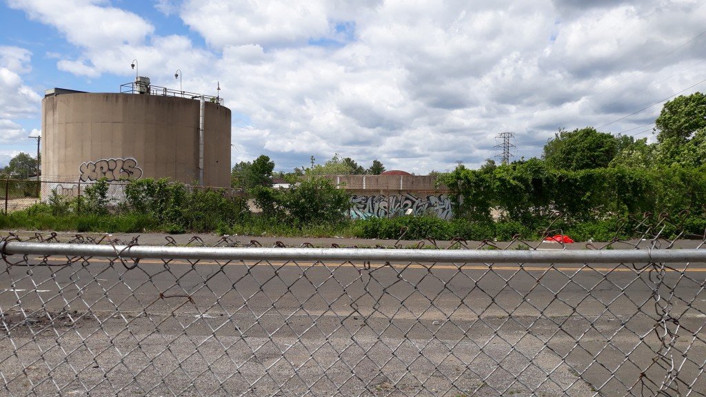
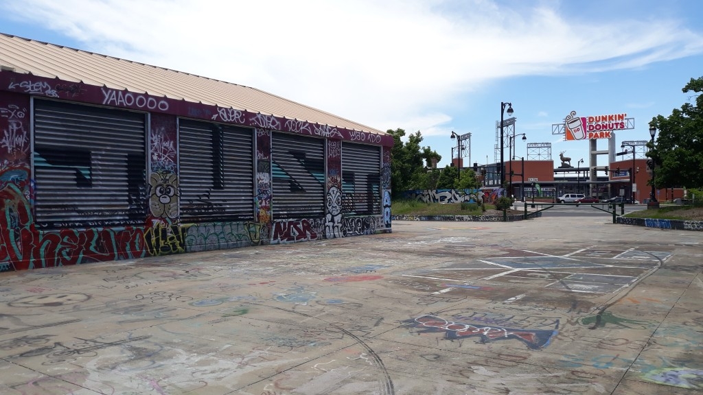
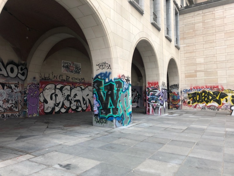
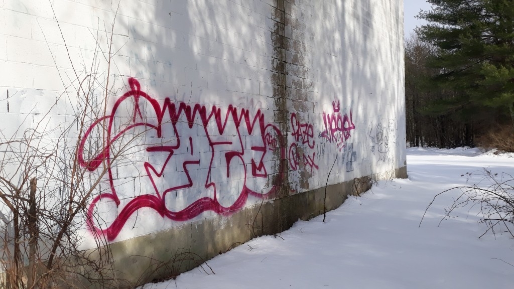
That concrete isn't holding the paint well.
-
2
-
-
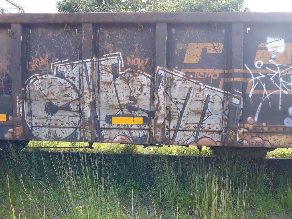
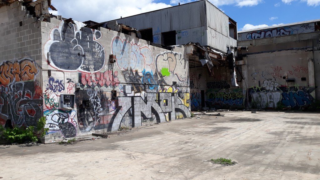
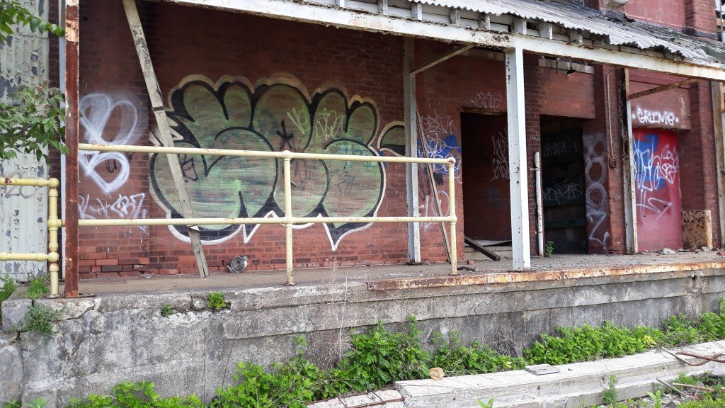
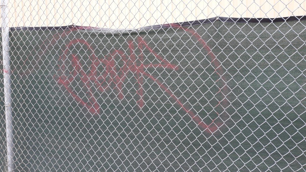
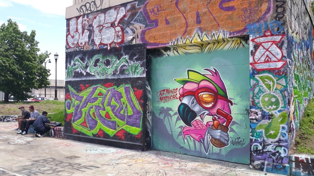
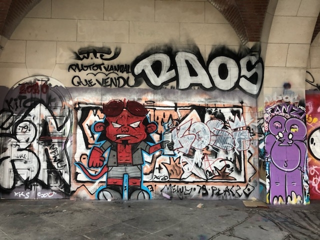
^Smash, smash & trash.
I'm about that.

-
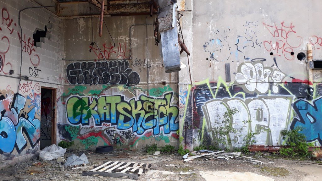
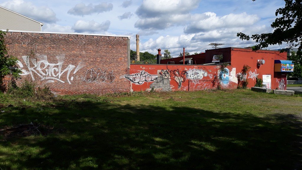
You might be special.
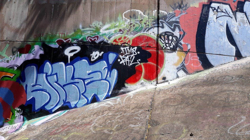
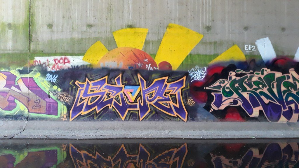
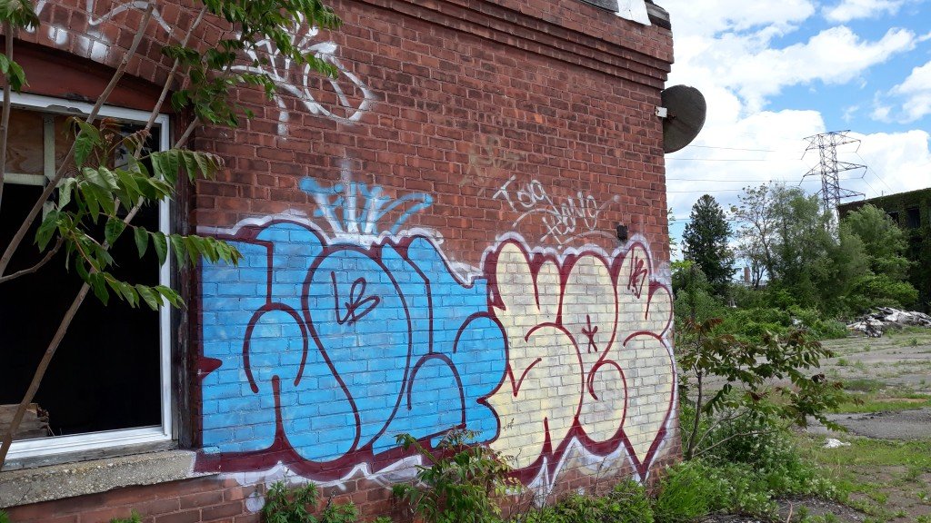
The bottom page was done by Pacer in 2015 & the top was done by Novel in 2019.
-
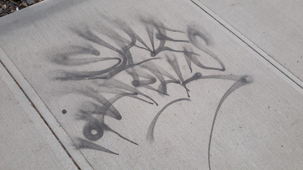
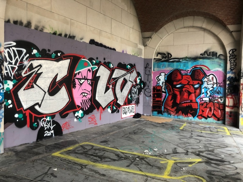
Smash them both.
-
I'd like to read something new and interesting now.
Cool story bro.


Toys post here...
in Paper Chase
Posted
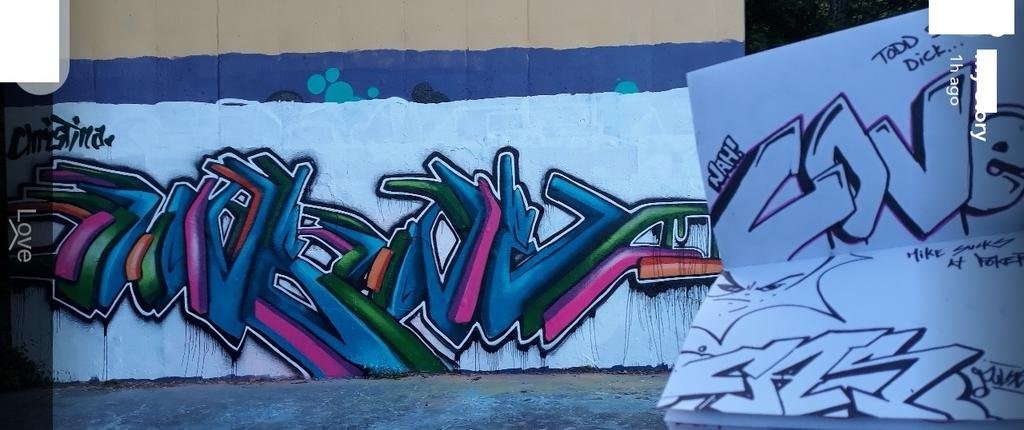
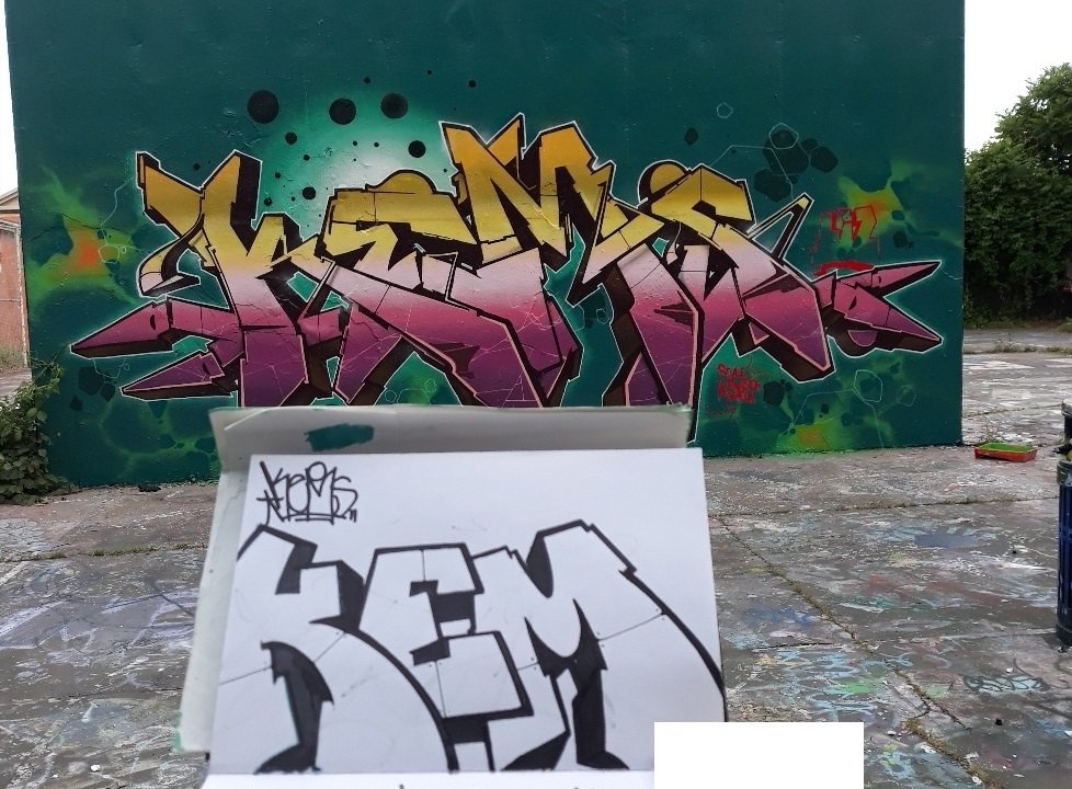
Thanks a lot for making this post. I have heard that same comment about me having my own abstract style to my letters before and that humors me to hear it again.
The line in the B that I added in was to separate the letter from looking like an 8. I agree with what you said in defining the D more sharply as compared to the o, I did actually try to make them distinctly in my drawing.
But I do take pride in my one liners. But this word's lettering is too repetitive for me and I was just bored enough to sketch some new letterings with a test name.